Santai means relaxed or at ease in Indonesian, so the identity moved toward a soft botanical mark instead of a purely mechanical AI symbol.
Sant.ai Brand Discovery Process
LOGO DESIGN

For Santai, I worked as a full stack developer and led the landing page design and logo design. The identity needed to feel calm and botanical without losing the clarity expected from an AI workspace.
The initial logo prompt required the S to be prominent, which led to several S-led directions before the final flower system became the stronger read.
The final logo keeps the heavy rounded Santai wordmark direct and product-like, while the mark carries the calmer human tone.
I paired the identity system with full-stack implementation work, shaping the public landing page around bold crops, high contrast, and a fast design loop.
#10F087#13B172#56C9CA#11110F

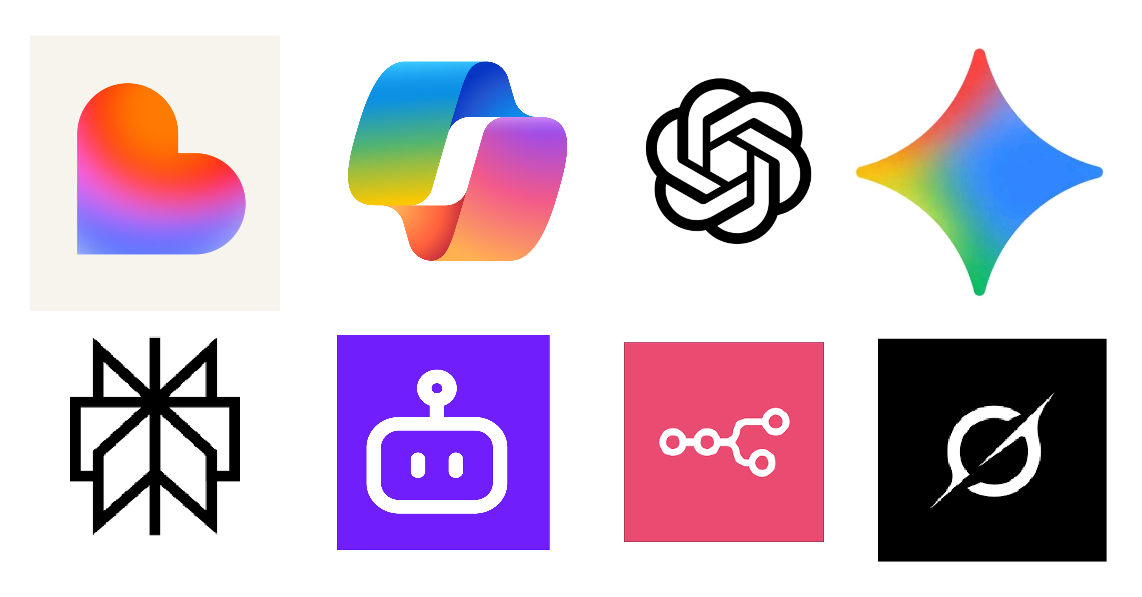
Comparison with existing AI brand logos
The visual research made the category pattern obvious: many large AI logos were abstract, symmetrical, and a little impersonal. Santai intentionally pushed against that by tying the system back to the meaning of the word: relaxed, easeful, and zen.
- Large AI company logos often lean into abstract gradients, radial symmetry, loops, sparks, and technical geometry.
- For Santai, the goal was to step away from that impersonal direction and make the mark feel calmer, more tactile, and more human.
- The final flower still uses radial symmetry, but the intention shifted the read from machine-symbol to zen, botanical, and relaxed.